


9# Pivot levels Trading System
Submit by Joy22
For any market, there is an equilibrium point around which
trading activity occurs. In the absence of large numbers of
new buyers or sellers, this point serves as the pivot or focal
point for market makers as they adjust their bids and
offers. When prices move away from the pivot, there are
zones of support and resistance that can be derived from
the established value area in the market. Penetration of
these zones leads to perceived changes in valuation and the
entry of new players into the market.
The pivot point and its support and resistance pairs are
defined as follows:
Pivot Point (P) = (H+L+C)/3
First resistance level (R1) = (2*P)-L
First support level (S1) = (2*P)-H
Second resistance level (R2) = P+(R1-S1)
Second support level (S2) = P-(R1-S1)
where H, L, C are the previous day’s high, low and close, respectively.
If either of these first levels is penetrated, off-floor traders are attracted into the market.
These breakout levels then usually reverse their function and serve as test points, i.e.,
previous resistance becomes support or previous support becomes resistance. The range of trading has expanded and if a second support or resistance level is breached then longer term trades will be attracted.
The valuation parameters used by market makers can be
calculated with the simple formulas above. Knowledge of
the levels at which different types of traders enter the
market can help in determining when a shift in valuation by
the locals has occurred.
As with traditional technical analysis, should these levels
fail then the second levels will come into play. If this next
support and resistance band fails then a new influx of
players will come in and likely start a trend in motion.
Market makers regularly take the market up and down
within their value range so orders placed within it are likely
to be executed. This can cause a problem as whipsaws can
occur. However, by placing stop orders outside this range it
is more likely that a trend emerging from the local “noise”
of the market can be captured.
Some charting packages, like Intellichart, allow you to draw
pivots automatically; although, in other charting packages,
pivots aren’t included. If that’s the case, you can easily
build a simple pivots calculator on Excel (using the formulas
provided above), or search on Google for a free one.
Let’s take a look at some practical examples.
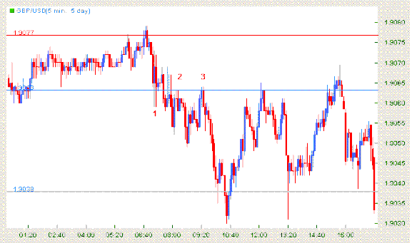
As you can see in this GBP/USD 5 minutes chart, the blue
lines represent the support lines, and the red line
represents the resistance area.
The line at 1.9063 is the first support level (S1); the one at
1.9077 is the first resistance level (R1); and the other one
at 1.9038 is the second support level (S2). The points 1, 2
and 3 show us clearly that prices are facing some
congestion area. Notice that only the shadows of the
candlesticks have penetrated the S1 line. At point 1, the
prices are going down from R1 to S1, but they remain
above this last line, so S1 is acting as a strong support.
Then, they try to cross it down and they do that but not
without two different retracements to the points 2 and 3. It is easy to see that S1 is now acting as a resistance, so you
can expect prices to fall to S2. Again, only the shadows
surpass the line. At point 3, sellers gain strength and the
price goes down to the S2 area.
You can clearly see that these lines represent strong
support and resistance areas. This is why they give you a
great assistance in order to choose the best stop losses and
targets.
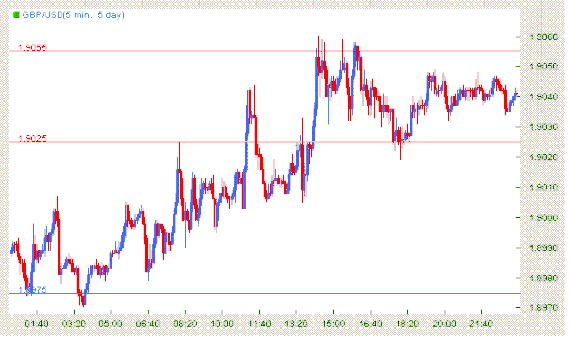
In this GBP/USD 5 minutes chart, you can see three lines:
one at 1.8975 (the blue one) which represents the first
level of support (S1), another one at 1.9025 which
represents the first level of resistance (R1), and the last
one at 1.9055 which represents the second level of
resistance (R2).
As you can see, the prices were moving up from the S1
area until they touch the R1 line. At this point, GBP/USD
faced a resistance, and retraced. After that, GBP/USD
started to go up again; this time it passed the R1, retraced
again to the area below R1 but above the price reached on
the first retracement, and started to go up again. This time,
the prices went to the R2 area and then came back to the
R1 again.
As you can see, at first, R1 acted as a resistance and then,
when the prices reached R2, it acted as a support. This is
how pivots usually act.
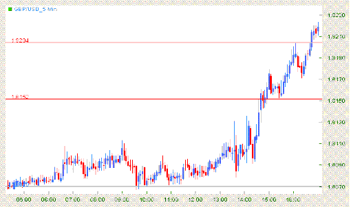
In this GBP/USD 5 minutes chart, you can see three
different lines: the first one is the first support level (S1) at
1.8070, the second one is the first level of resistance (R1)
at 1.8152, and the third one is the second level of
resistance (R2) at 1.8204. As you can see in this chart, prices were oscillating around
the S1 area. Prices were facing a strong support, until they
managed to reach R1. They have crossed above the line
but retraced back. At this moment, R1 is acting as a
support, pointing for higher prices and a good target at R2.
As expected, prices gained strength and jumped until they
reached R2. As you can see, R1 started to act as a
resistance area and then began to act as a support area.
This gives you an idea of what should happen and where
the trend may face a strong resistance.
Pivot Indicator Trading
Pivot Points forex Strategies
9# Pivot Strategy - Forex Strategies - Forex Resources - Forex ...
136# 1 min Scalping with Pivot Points (IX) - Forex Strategies -
10# Pivot Intraday - Forex Strategies - Forex Resources - Forex ...
Pivot Points - Forex Strategies - Forex Resources - Forex Trading ...
40# MACD, RSI, 50 Ema and Pivot Points - Forex Strategies -
6# Pivot and RSI Divergence - Forex Strategies - Forex Resources
3 Metatrader Daily Pivot and Cam Pivot - Forex Strategies - Forex ...
13# Fibopivot Channel Strategy - Forex Strategies - Forex ...
14# Pivots Levels, Ema Channel and MACD - Forex Strategies ...
17# Pips Swing fx strategy - Forex Strategies - Forex Resources
16# Trade Forex using Pivot Points - Forex Strategies - Forex ...
4 Metatrader Fib Pivot, Floor Pivot, Dyn Pivot - Forex Strategies ...
2# Trading with the Camarilla Equation - Forex Strategies - Forex ...
Tools - Forex Strategies - Forex Resources - Forex Trading-free ...
5# Pivot System - Forex Strategies - Forex Resources - Forex ...
15# Pivot Point Method - Forex Strategies - Forex Resources -
1# Camarilla Equation - Forex Strategies - Forex Resources -
149# Pivots Strategy - Forex Strategies - Forex Resources -
5 Metatrader Pimspit pivots and others - Forex Strategies - Forex ...

Write a comment