


Chart 3 – March 6, 2007 at 2:00 The Optimum Long Entry
This chart is a good example of the what
an optimum entry point looks like for a
long trade.
Notice first that the 4H actually led the
entry to the trade and broke the 20 line
first. This is the best possible situation as
we know that the lower time frames are
building a strong up trend.
The rest of the time frames have nice
parallel lines, they are all moving at the
same slope and all have their stochastic
lines about the same distance apart. In
other words the stochastics are almost
identical on each chart.
Just for the record, this trade would have
netted you anywhere from 50-200 pips!
Take this chart and post it on your wall
as a reference.
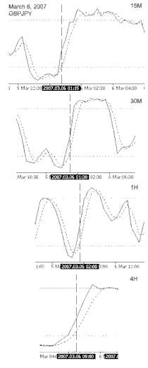
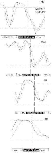
Chart 3b – March 7, 2007 at 2:30 The Optimum Short Entry
This is a chart of the optimum short entry setup.
This is an example of cheating a little and
entering when the 1H is halfway through the
candle. Trading live is much different than
looking at historic charts. During this time frame
the movement was quite simple to see.
Again the 4H leads the trade entry and the
downward stochastics of the other time frames are
making identical moves.
Another easy trade and the pips gain anywhere
from 90-200 pips.


Write a comment